Brand identity · Beauty
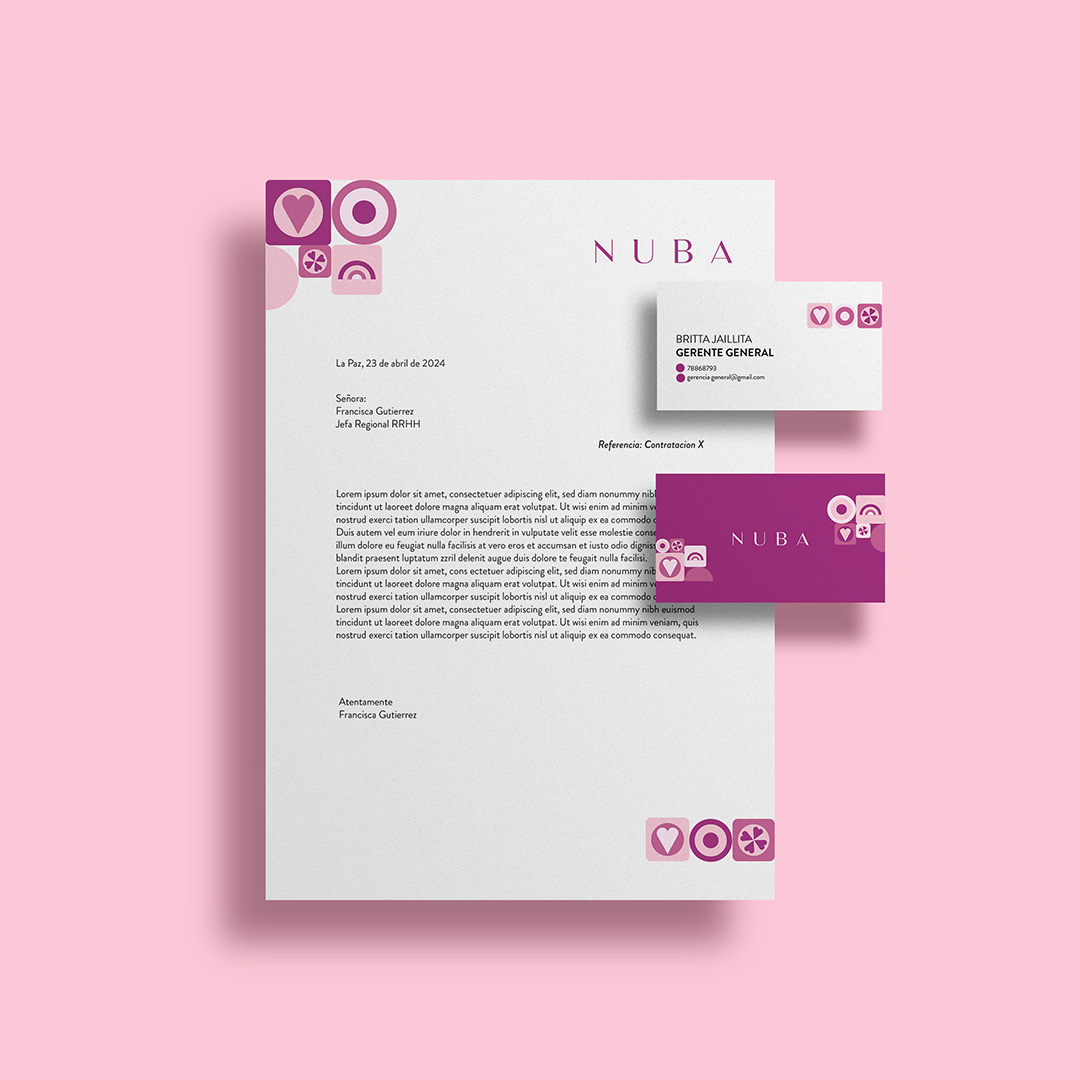
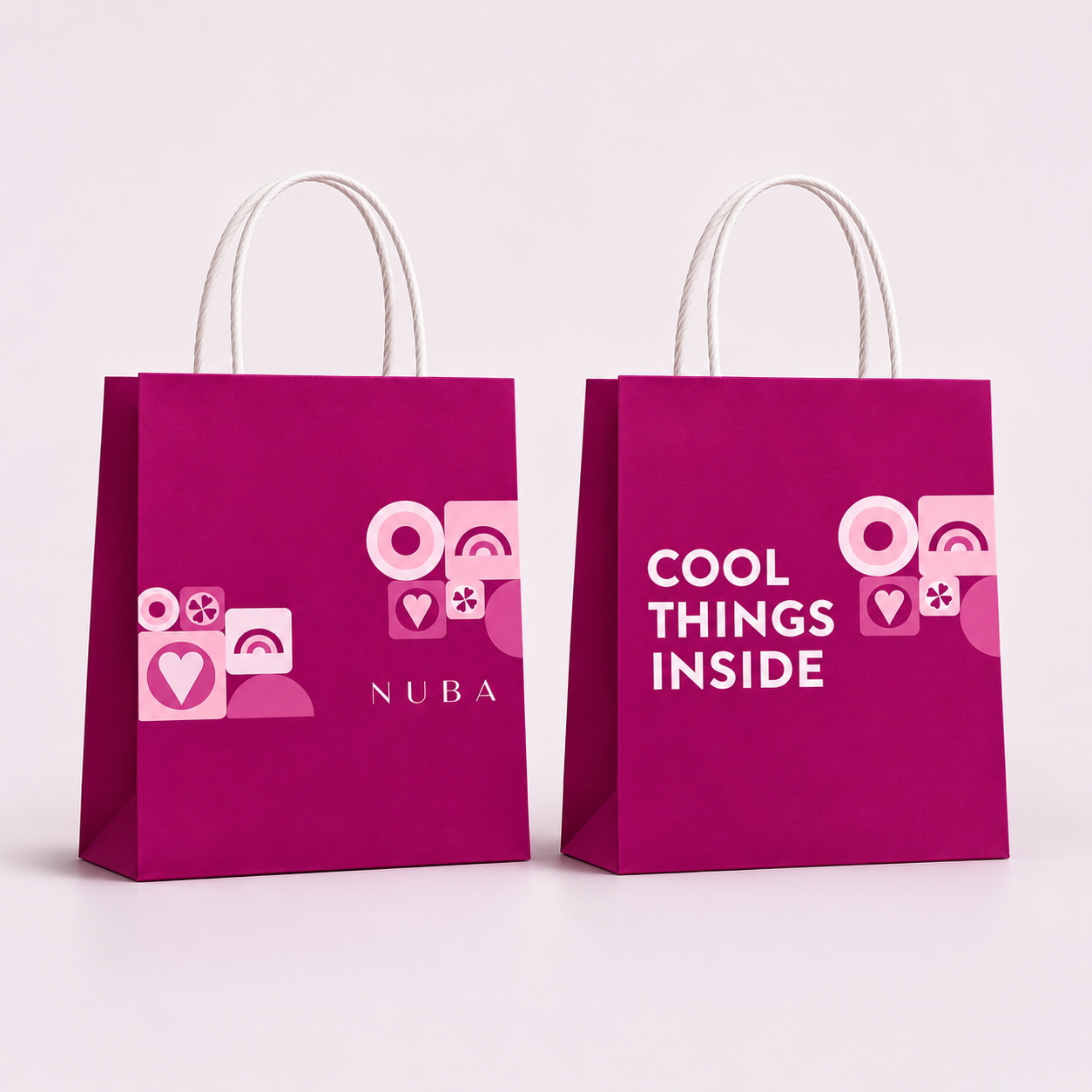
A full identity relaunch for Nuba – new mark, icon system, colour palette, stationery, packaging and storefronts, carried through to seasonal campaigns, social and a short brand animation. Concept, art direction and production, start to finish. 2024.
Role – Creative & Design Lead
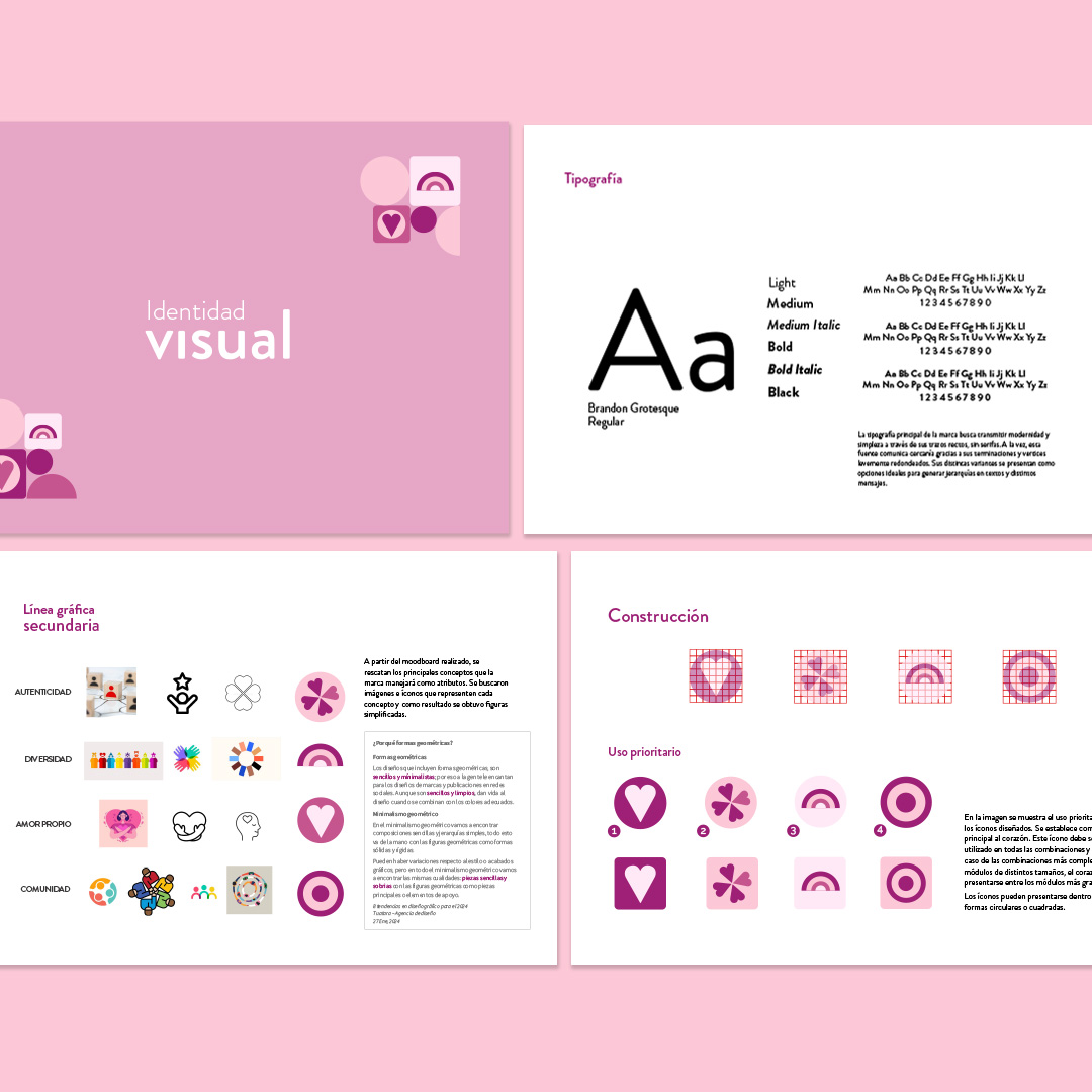
Nuba needed a sharper, more confident identity – one mark and icon set that could carry across stationery, packaging and social without leaning on stock imagery to do the talking.
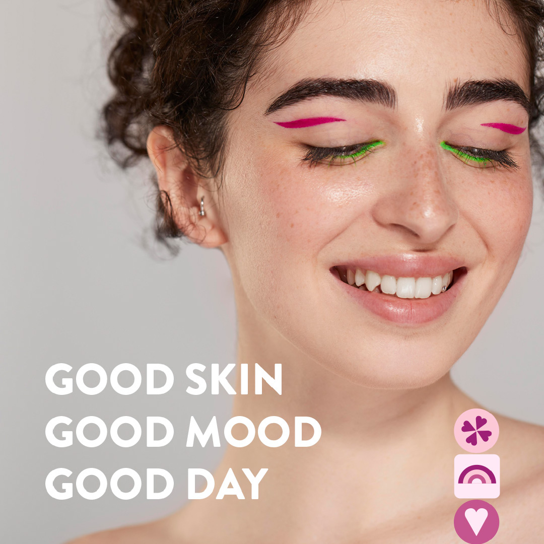
The answer was a small vocabulary of geometric icons – a heart, a clover, a rainbow, a ring – built around a single bold magenta, flexible enough to recombine across every touchpoint while staying instantly recognisable as Nuba.
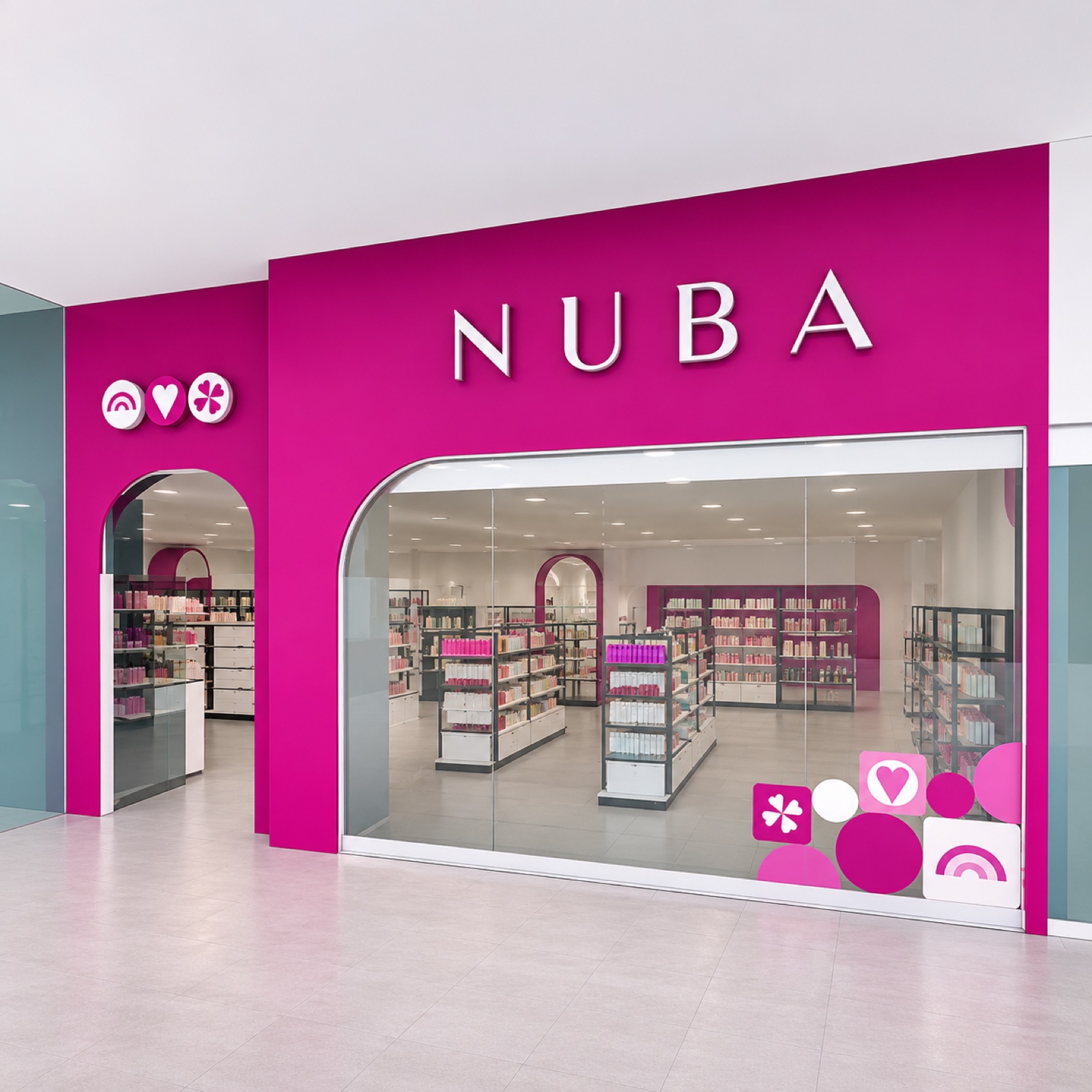
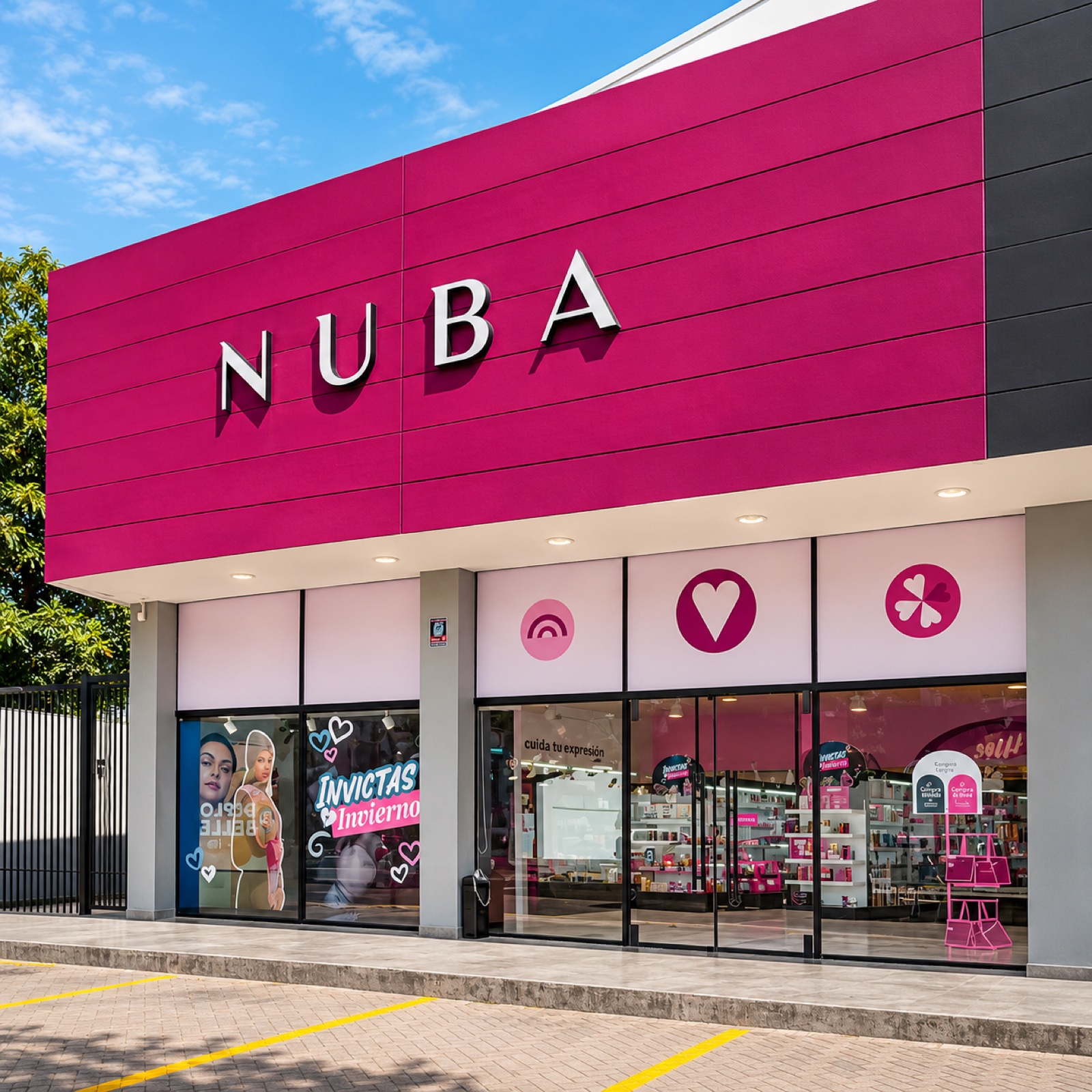
The identity was built to scale up as well as down – from a business card to a full shopfront. The icon set and magenta palette carry through the storefront signage, window displays and in-store wayfinding, applied consistently from the first concept render through to the stores now trading on the ground.
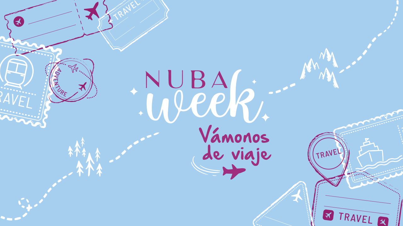
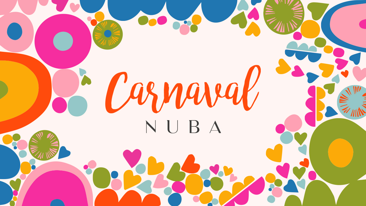
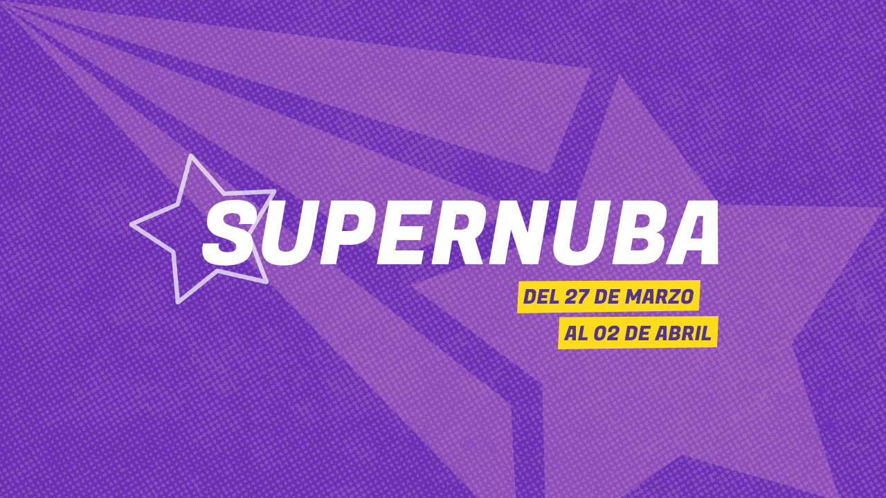
Beyond the core identity, the icon set and magenta palette carry into Nuba's recurring seasonal campaigns – distinct ideas for Nuba Week, Carnaval and Supernuba, each with its own mood while staying recognisably Nuba underneath.
One small icon vocabulary now runs the whole Nuba identity – stationery, packaging, storefronts, social and motion – recognisable at a glance whether it's printed on a bag, built into a shopfront or looping on a screen. Today, Nuba continues to use this visual identity across its communications and in more than 10 stores throughout Bolivia.
I design the system behind the logo – the part that keeps a brand looking like itself everywhere it shows up.